The Power of Typography: How To Design A Better Poster In 2023
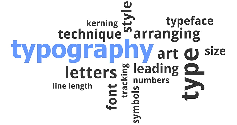
Typography is the skill and art of arranging type, and it is a potent tool that can elevate or subtract from a design. Font has an even more important role when it comes to making posters. A basic poster can be turned into an engaging and eye-catching piece of art with the appropriate font, layout, and text treatment selections. We’ll look at the enormous power of typography in this guide, along with some tips for using it to really make your poster pop.
Table of Contents
Toggle
The Impact of Typography
Typography is more than just text; it’s a visual component that conveys emotion and meaning. It has the capacity to stir up emotions, transmit ideas, and hold the interest of the audience. Here are some reasons why typography is so important in design:
- Typography Sets the Tone
Your poster’s tone can be determined by the typeface you select. Various fonts elicit distinct feelings. For instance, a poster for a children’s event might look great with a funny, rounded font, but a corporate event would be better with a sleek, modern font. The typeface you choose will immediately convey the tone of your design.
- Typography Enhances Readability
Any poster’s main objective is to communicate information. Using good font makes sure that your message is readable and understandable. Readability is influenced by alignment, line spacing, and font size. Your poster won’t accomplish its goal if it is hard to read.
- Typography Creates Visual Hierarchy
A poster with good design has a distinct visual hierarchy. This directs the viewer’s attention through the content by emphasizing crucial information. By creating this hierarchy and using font styles, weights, and sizes, you can increase the impact of your message.
- Typography Conveys Brand Identity
Consistent typography is a crucial part of brand identity for companies and organizations. The text treatments and fonts used in marketing materials, such as posters, support and enhance the brand’s image by making it instantly identifiable to the target audience.
- Typography as an Artistic Element
It is a visual art form in addition to a tool for informational communication. Your poster can gain an artistic dimension and distinctive visual effects by arranging the letters and words in a certain way. Forms, patterns, and images can be created with typography to improve the overall design.


Making Your Poster Stand Out with Typography
Now that we are aware of typography’s influence, let’s look at some strategies for utilizing it to create a poster that will stand out:
- Choose the Right Typeface
One of the most important choices in poster design is the typeface selection. Think about the character and tone you wish to portray. Select a font style that complements your message, whether it be bold, elegant, serious, or silly.
- Experiment with Font Pairing
Using a variety of font combinations can give your poster depth and appeal. For headings, use a bold, eye-catching font; for the body of the text, use a more readable font. Try different font combinations to get a striking visual effect.
- Pay Attention to Leading
Readability depends on leading, or the distance between text lines. To achieve the ideal balance, adjust the leading so that there is just enough room for clarity without looking cluttered.
- Play with Typography Effects
It can improve your poster with a variety of effects. To create visually striking text elements, try out different techniques such as drop shadows, outlines, gradients, and text paths.
- Use Color Wisely
Your poster’s overall appearance can be affected by the color of your text. Color can produce contrast and elicit strong feelings. Make sure the color of your text is both readable and blends in with the background.
- Embrace Negative Space
Avoid packing your poster with too much text. In order to achieve a neat and organized appearance, leave plenty of negative space. Additionally, you can use negative space to direct the viewer’s attention and draw attention to key content.
- Maintain Consistency
For typography to be effective, consistency is essential. Remain consistent in your style and use a small selection of fonts for your entire poster. This guarantees a unified and polished appearance.
- Make Typography the Focal Point
It can serve as the main visual element in certain posters. Make text the main focus to fully embrace its power. Try using attention-grabbing headlines and simple layouts to emphasize your point.
- Seek Inspiration and Feedback
Look through books, online galleries, and design magazines as sources of inspiration for your work. To improve your typography, ask fellow students and mentors for feedback. You can explore new ideas and improve your design with the help of inspiration and feedback.
- Practice and Experiment
Your skill that can be developed through practice. To find your own style, try out various typefaces, layouts, and effects. Take chances and push the limits of design without fear.
If you want to learn more about leading typography then please check out our other blogs with similar topics. This might help you to understand that concept in detail.
Conclusion
In summary, typography is a powerful component of poster design that can convey brand identity, establish hierarchy, improve readability, set the mood, and give your creation a more artistic touch. You can make your poster stand out by selecting the appropriate typefaces, experimenting with font pairings, and using effects sparingly. Accept white space, stay consistent, and, when necessary, make typography the main attraction. Use typography to your advantage to make captivating and effective posters by getting ideas, getting feedback, and most of all, practicing.
clixtroindia
clixtroYou Might Also Like
- clixtroindia
- 0 Comments
- clixtroindia
- 0 Comments


